Surely we aren’t the only parents who fight with their kids, right?
Hard to determine a winner… because I’m not sure there was a loser.

Our Journey as we chase the dream of sailing the world!
Surely we aren’t the only parents who fight with their kids, right?
Hard to determine a winner… because I’m not sure there was a loser.
I had a several hour wait between VA appointments yesterday. I found myself an out-of-the-way chair and sat to wait. While there I was able to observe many veterans and VA staff as they passed by and I was struck with an insight about our need for diversity.
The veterans I saw (as well as those I know from elsewhere) largely fit a few stereotypes, while the VA staff largely fit into a few completely different ones. (As with all generalities, they won’t apply to every individual; there are plenty of exceptions.) And I was struck by the need for both today.
Due to the nature of the work they are asked to do, Veterans can be gruff, disciplined, hardened, unyielding, unforgiving, strong, etc. They are trained for violence, uniformity is drilled into them, they’ve make due with cold food from an MRE bag; they’ll go THROUGH a wall to accomplish a task, . They study military tactics and criminal justice. They are who you want with you if a fight broke out.
The VA staff are largely not that way. They are the people who are more compassionate, tender, merciful, willing to compromise, able to see the pain of others. They are healers. They want to save the world, they wear peace symbols on their clothes, they see beauty in variety, they sip latte’s from their Starbucks mugs. They study social sciences and protest for civil rights. They run or call 911 when the fight breaks out.
But like a symbiotic relationship, both sets of these characteristics are good and desirable. The veteran, trained for violence, keeps the world peaceful for the healer; their strength provides stability, safety, and security. The healer works to put the veteran back together again physically and emotionally; they remove the sting/pain of the violence that the veteran has experienced. They help the violent find peace.
 My Facebook Pic
 Sticker on my Physical Therapist’s backpack
Without the violent/strong/brave the caregivers world would be unsafe. They would be subject to the whims of the cruel and uncaring. Without the healers, the world would be cold and ugly and full of suffering. They help to show us the beauty that exists around us.
Again, not every veteran fits the description, nor does every healer. There is plenty of overlap, but I feel the premise is true. I think the two groups would generally have very different world views and sets of values. You might say one group is described by the world “Justice” and the other by the word “Mercy”.
What I’m trying to convey is that as a society, we need both. We need justice amongst us, and we need mercy too. We need those who are strong and unyielding. We equally need those who are tender and compassionate. Without a sheepdog the flock of sheep would be destroyed by the wolves, but there would be no point in having just a flock of sheepdogs. It is only the combination of sheep and sheepdog that has any benefit.
There are limits to the value of diversity to be sure, and perhaps I’ll write something about that in a different post, but I wanted to express that I see the value in having several viewpoints by which to evaluate the world. And I hope you can as well.
I’ve noticed that when sharing my blog posts to Facebook, that there is no picture/icon next to the link. I believe that it is because I haven’t created an icon to load to the blog site (If I’m wrong about that, please let me know). I’ve found where to upload one to the blog, so now I’ve been trying to design something that I like. Let me show you some of the designs I came up with. I’d love some opinions!
I started off really simple. This is just a letter “J” inside an oval. Really simple.  I toyed around with some different fonts and colors of course. I’m not sure why I liked this font so much, perhaps because it reminded me of a fish hook and seemed appropriate if I’m trying to live on a boat.
 This was the second attempt. I just added a shaded box behind it to see how it looked. It’s not bad. I kept playing though because I wasn’t really sold on either of them.
 This next one was my just a different color J. Nothing fancy still. At this point I was still reacquainting myself with PowerPoint’s design/draw options (I didn’t know you COULD draw/design in PowerPoint, but it was a tool I used a lot in Military Intel).


These were me adding a few icons from PowerPoint’s default selection. I could make those just about anything I wanted them to be, but used water-themed icons here. They could be flowers, cows, or anything else.
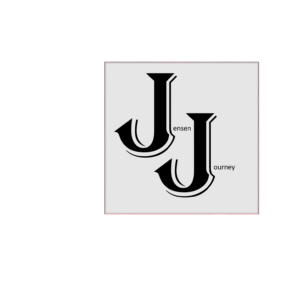
This one was me deciding I wanted to get away from the oval entirely. Instead of just the letter “J” I added the text boxes so it reads Jensen Journey. Still kept the fishhook font (Algerian).


These next two are same fonts, but changed the background colors and added a gradient so they are darker on bottom. That blue one made me think of possibly adding a boat near the top so it looked like the blue was the increasing depths of the ocean. Or possibly adding a fishing line that is attached to one of my J hooks. I didn’t do it, so I can’t show it to you, but it’s a thought.

This one was me playing with that background of the three above. I rotated the square background and leaned it just a bit. I tend to like black and white, so this was my first one using just those colors. I like it!


Here we have the same as the black one above, but using shades of gray. I also added the patterned border.
Same thing here… just a different shade of gray. It turns out there are at least 50 shades of it.
 Here I made a significant switch. I wasn’t sure I wanted the Icon/Logo to have “Jensen Journey” written out, and decided just putting a “J” in front of a cool background should work.
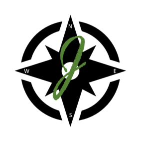
I couldn’t actually find a compass in PowerPoint, but I found the design in black and added the compass points myself via text boxes. Then I went through a whole load of fonts before I decided I liked this one (which mimics the J I use when signing my name). I liked the way the dark green stood out with the black background.
 Here I decided to just add the blue background to the one above. I thought about adding the gradient blue, and could still do that.
 Here I kept the same design aspects but went back to the text saying Jensen Journey but with the cursive type J instead of the fishhook.

Just playing around with different background colors.

I toyed with different compass colors too, but decided black was best.
 And this is the last one I’ve done. I kept the black compass but put in on a gold background. I kept the dark green “J” because I just thought it looked best and was easiest to read with the background colors. I also stayed with the Jensen Journey text.
I did already save this as the blog “Icon” but you may see it changed occasionally. I’m hoping that since I’ve saved it that when I publish this post and then share it to Facebook that this Icon will appear next to the link for you.
I also really liked the plain black compass with the lone cursive “J” and might decide that the text is cumbersome, so don’t be shocked if you see that one used here at some point. At some point we’ll probably settle on one that we keep, but not yet. These aren’t really hard to do, and I had fun doing them, so maybe I’ll do something completely different. I guess that’s part of the journey!
Let me here some feedback on what you liked and why.
Most people I know have seen the movie The Hobbit: An Unexpected Journey. I smile ear to ear watching Bilbo Baggins run from his hobbit hole, coat tails flapping behind him, and a look of exuberance on his face as he runs to catch up to his dwarf companions. A bystander asks him where he is going, to which he joyfully replies, “I’m going on an adventure!” as he gallops headfirst into the unknown.
That scene encapsulates what we’re going through now. The Jensen family is contemplating ‘going on an adventure’ of our own. Because of our current homelessness we’ve been discussing all sorts of potential housing options. Most of these include the ordinary home with bedrooms, bathrooms, and a yard. Others don’t. The one that is striking us with the most electric-like excitement right now is living on a boat.
None of us are seafarers. None of us have ever sailed before. I’m pretty sure we’re all susceptible to seasickness. So maybe we’re enjoyably “suffering” from delusions of grandeur, but we’re seriously thinking of this; of finding a boat/ship large enough for a family of 10 and spending a year or more living on it, sailing/motoring around the seas, and experiencing new things that this big beautiful world has to offer.
Would we like it to happen? Absolutely! Will it happen? No idea!
We may do our research, look at our resources, listen to advice, and then land back on our 120 acre farm in Missouri. Or maybe someplace else. But we thought it would be nice for family, friends, and others, if we were to document what we are doing and learning, share with you our obstacles and decision making, and (if this dream is realized) give you a way to track where we are and what adventures we are on.
But whether we end up on a boat or not, the journey to learn what we would need to learn and decide what needs deciding WILL be an adventure.
And we invite you to come along with us!