
I’ve noticed that when sharing my blog posts to Facebook, that there is no picture/icon next to the link. I believe that it is because I haven’t created an icon to load to the blog site (If I’m wrong about that, please let me know). I’ve found where to upload one to the blog, so now I’ve been trying to design something that I like. Let me show you some of the designs I came up with. I’d love some opinions!
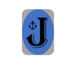
I started off really simple. This is just a letter “J” inside an oval. Really simple.  I toyed around with some different fonts and colors of course. I’m not sure why I liked this font so much, perhaps because it reminded me of a fish hook and seemed appropriate if I’m trying to live on a boat.
 This was the second attempt. I just added a shaded box behind it to see how it looked. It’s not bad. I kept playing though because I wasn’t really sold on either of them.
 This next one was my just a different color J. Nothing fancy still. At this point I was still reacquainting myself with PowerPoint’s design/draw options (I didn’t know you COULD draw/design in PowerPoint, but it was a tool I used a lot in Military Intel).

These were me adding a few icons from PowerPoint’s default selection. I could make those just about anything I wanted them to be, but used water-themed icons here. They could be flowers, cows, or anything else.

This one was me deciding I wanted to get away from the oval entirely. Instead of just the letter “J” I added the text boxes so it reads Jensen Journey. Still kept the fishhook font (Algerian).


These next two are same fonts, but changed the background colors and added a gradient so they are darker on bottom. That blue one made me think of possibly adding a boat near the top so it looked like the blue was the increasing depths of the ocean. Or possibly adding a fishing line that is attached to one of my J hooks. I didn’t do it, so I can’t show it to you, but it’s a thought.

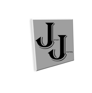
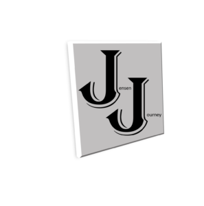
This one was me playing with that background of the three above. I rotated the square background and leaned it just a bit. I tend to like black and white, so this was my first one using just those colors. I like it!
Here we have the same as the black one above, but using shades of gray. I also added the patterned border.
Same thing here… just a different shade of gray. It turns out there are at least 50 shades of it.
 Here I made a significant switch. I wasn’t sure I wanted the Icon/Logo to have “Jensen Journey” written out, and decided just putting a “J” in front of a cool background should work.
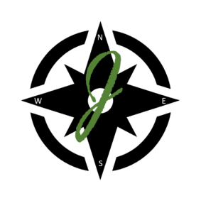
I couldn’t actually find a compass in PowerPoint, but I found the design in black and added the compass points myself via text boxes. Then I went through a whole load of fonts before I decided I liked this one (which mimics the J I use when signing my name). I liked the way the dark green stood out with the black background.
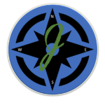 Here I decided to just add the blue background to the one above. I thought about adding the gradient blue, and could still do that.
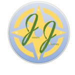
 Here I kept the same design aspects but went back to the text saying Jensen Journey but with the cursive type J instead of the fishhook.

Just playing around with different background colors.
I toyed with different compass colors too, but decided black was best.
 And this is the last one I’ve done. I kept the black compass but put in on a gold background. I kept the dark green “J” because I just thought it looked best and was easiest to read with the background colors. I also stayed with the Jensen Journey text.
I did already save this as the blog “Icon” but you may see it changed occasionally. I’m hoping that since I’ve saved it that when I publish this post and then share it to Facebook that this Icon will appear next to the link for you.
I also really liked the plain black compass with the lone cursive “J” and might decide that the text is cumbersome, so don’t be shocked if you see that one used here at some point. At some point we’ll probably settle on one that we keep, but not yet. These aren’t really hard to do, and I had fun doing them, so maybe I’ll do something completely different. I guess that’s part of the journey!
Let me here some feedback on what you liked and why.
I like the first compass with the green J
I like the first one with the green J. I think it stands out more.
These are all fun! I really like the first J J square with the words behind it, but i think it almost looks too professional for a fun family icon.😂 I think my favorites would be combinations of some of them. .. The gradient blue Jensen Journey with your idea of the fish hook, or even an anchor, off of one of the J’ s; or using your first compass (black on white) and puitng your (probably still in cursive) double J logo on it!
Well thanks for thinking it looked professional!